LINE Translation
Staying connected around the world.
Overview
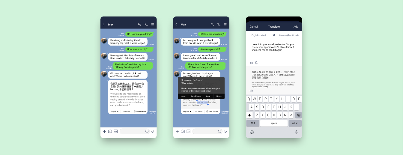
LINE Translation is a feature design allowing users to translate incoming and outgoing messages right in the chatroom, bringing people closer together and fostering language learning by helping them stay connected all within the app.
Users may utilize an audio pronunciation aid, highlight specific words to look up dictionary definitions, and save translated words and phrases to an in-app Phrase Book for review.
Video of final prototype walkthrough
BACKGROUND
LINE is a free mobile social messaging app with the purpose of “bringing people, information, and services ever closer together.” With an expanding user base in the Asia Pacific region and abroad, LINE helps users stay in touch around the world.
However, many users are copying and pasting messages into Google Translate when communicating in different languages. When there is a language barrier, the inability to easily understand messages can lead to misunderstandings and missed opportunities.
My Role
UX/UI, Research, Interaction DesignTimeline
4 weeks / April 2020Tools
Figma, Adobe Photoshop, Air Table, Whimsical, Google Forms
How can users stay connected to the people they care about without seeking translation solutions outside the app?
Preliminary Research
COMPETITOR TRANSLATORS
With so many social messaging platforms out there, I conducted a competitive analysis to compare translation in other apps, understand existing UI patterns, and identify areas of improvement. It was surprising that WhatsApp, one of the most widely used global messaging apps, also did not have a translation feature and had many users requesting for one.

STRENGTHS
Tap-to-translate works seamlessly
Voice to translate option
Translation features mimic user patterns from Google Translate’s UI
Clean and intuitive UI design
WEAKNESSES
Bot translators are inconvenient
Users are often unaware of available translation features
Limited language options
Auto-translation often inaccurate
HEURISTIC EVALUATION
Understanding LINE’s guidelines and content hierarchy was important since my goal is to design an integrated feature. I evaluated core screens according to Jacob Nielsen’s 10 Usability Heuristics to familiarize myself with the app’s usability.
During this process, I discovered that LINE had a translator bot feature. The existing tool was difficult to locate and inefficient to use for chatting. It functioned more as an automatic all-purpose translator and still required manual effort from users.
The heuristic evaluation revealed inefficient usability in LINE’s existing bot translator.
QUANTITATIVE SURVEYS
To gather quantitative data on app usage and language fluency, I sent out a survey asking participants about their messaging habits and languages they communicated in. I received 15 responses with the majority of participants located in the US.
Key survey results show fluency gap in speaking vs reading/writing a second language.
Of the participants who knew a secondary language, 50% of them were using that language frequently while messaging. However, there is a noticeable fluency gap between reading/writing and speaking/understanding in that secondary language. This indicates the presence of a language barrier when using text communications.
QUALITATIVE INTERVIEWS
I also conducted primary research through interviews with 7 participants who actively used LINE. To synthesize my findings, I took inspiration from the Rose, Bud, Thorn method of Design Thinking to identify what’s working, what’s not, and areas of opportunity for translation.
The Rose, Bud, Thorn method maps out key insights from user interview observations.
KEY RESEARCH INSIGHTS
After analyzing data gathered from my research efforts, I codified my findings into 3 categories -
Translation Efficiency
The “copy/paste” action is frustrating, particularly on mobile and for group chats.
Having to translate manually is too time-consuming.
The annoyance to translate causes users to ignore texts rather than understand them.
User Convenience
Users expect translation to happen immediately.
Users prefer being able to compare the original message with the translation.
The ability to select specific words helps with translation accuracy.
Language Learning
A surprising insight was the desire for language learning and expanding cultural horizons.
Translation is an easy way to learn new language vocabulary.
It’s rewarding to push beyond route translation and use it as an opportunity to learn.
“It’s bad, but I’ll ignore messages in Chinese from my parents ... I just can’t be bothered to translate. But if the message looks important then I’ll try to copy and paste it into Google Translate.”
“I know a little bit of Chinese, so I like being able to parse and compare the text to make sure I’m not misunderstanding the translation.”
“I like to make flashcards from words I’ve translated, because it’s useless if I have to translate the same thing 5 days later. I would have learned nothing.”
Conceptualization
During conceptualization, I used each of the above insights as a design goal to help drive feature prioritization. I was particularly curious about the language learning insight, and wanted to explore the extent that a flashcard add-on might be relevant with translation. This feature was eventually named the “Phrase Book” in my designs.
MAPPING OUT USER FLOWS
I started sketching out 4 main task flows for how a user would interact with the in-app translator. Most of the features would be done from the chatroom screen, since it was important for users to easily translate without having to leave the conversation.
Task flows showing 4 key tasks that users would likely go through when translating.
WIREFRAME CONCEPT SKETCHES
I explored my concepts visually by sketching out low-fi wireframes based on the core tasks, while keeping in mind common translation design patterns.
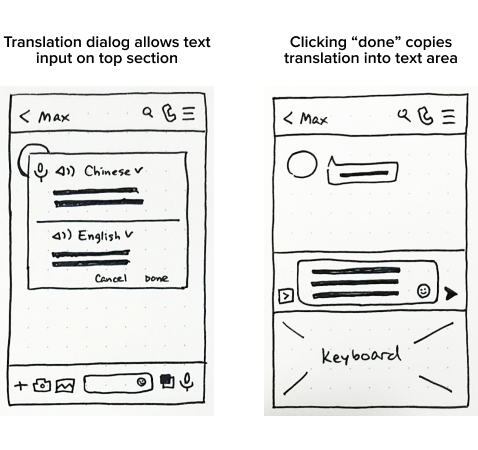
Outgoing Translation
My assumption was that users would prefer going into a separate translation window than typing in-chat.
I decided to test out this assumption during usability testing, and quickly iterate if needed for round 2.
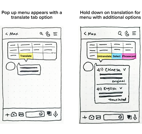
Incoming Translation
A tap-to-translate pattern is fast and mimics the initial action of copying text.
Users who may not be aware of a translation feature can easily find it if their instinct is to try copying first.
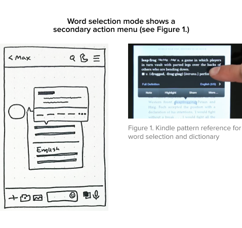
Word Selection
I referenced Kindle’s design pattern for word selection and lookup.
The question is whether users would find this interaction intuitive on LINE.
CHALLENGES & CONSIDERATIONS
An unexpected limitation was understanding consistent UI for iOS. This project focused on designing for iOS based on target user demographics from my surveys. In my sketches I drew a pop-up translator familiar to Android dialogs, only to realize that such designs are generally avoided in Apple’s Human Interface Guidelines. I immediately took time to study up on HIG so I had a better understanding of how to design and apply consistent patterns for iOS.
Another challenge was designing the interaction for selecting and highlighting a specific word within a text message. Strangely enough, testing out multiple competitor apps showed that this pattern does not exist in them! I went with a design that nests word selection within the main thumb menu, referencing a pattern used in Kindle. I knew I needed to test out my concept to see if users found the interaction intuitive.
MID-FIDELITY PROTOTYPE
I had two concepts outlined for the placement of the outgoing translation icon, as shown in these wireframes. I decided to do concept testing during my usability tests to get feedback on them, as I could iterate quickly for round 2 testing based on what users found more intuitive.
These selected mid-fi wireframes showcase the incoming and outgoing translation flows.
Concept & Usability Testing
In my project timeline I had planned two rounds of usability testing in order to focus on different learnings and drive fast iteration. For round 1 my goals were to:
Conduct concept testing - I presented two outgoing translation concepts in randomized orders.
Uncover user expectations - users were asked where they expect to find translation & how it works.
Test big picture usability flows - observing the thumb and menu tap interactions.
CHANGE IN TESTING PLANS
The timing for my usability testing came at an unlucky time. COVID-19 was spreading, and my city implemented stay at home regulations.
Due to the lack of time between the announcement and my scheduled tests, I had to switch to a remote testing format without time to set up the prototype for remote mobile testing.
This sudden change meant that my participants were testing a mobile design on their computer. I focused on follow-up questioning to ensure I could identify issues that weren’t a result of the test format.
USABILITY TEST 1 FINDINGS
UI was simple and intuitive - Most participants enjoyed the translation features and felt that they were easy to use.
Familiar patterns drove expectations - Actions such as tapping a message to bring up options or using the translation window were familiar patterns that all participants expected to do without too much thinking.
Accessing audio translation caused confusion because users did not know the difference between audio message recording and translation audio recording.
The need to enable message selection before selecting specific words within a message was most confusing for participants, and had only a 17% error-free rate during testing.
My assumption on outgoing translation was supported, with most users expecting to open a separate screen to initiate translation.
View full round 1 usability test findings
ITERATE, ITERATE, ITERATE
My first usability test helped me pinpoint crucial issues, why they happened, and solutions to iterate on. I was surprised to find how much I enjoyed this process of understanding the “why” behind user frustrations and brainstorming ways I could improve the experience!
I iterated on my designs into a high-fidelity prototype to validate the changes in a second round of testing. I also inserted screen animations and transitions to mimic real app flows and give the prototype a more realistic feel.
Word selection mimics text copying pattern
To reduce confusion on how to select a word within a message, I removed the “select” button under the translated message and put it under the tap-and-hold action menu. This provides a more intuitive word selection experience because users would already expect to tap on the message to try and perform a copy action.
Translation feature location
I revised the translation icon to be located under the “+” icon, due to the keyboard bar already being busy. When shown both concepts, participants did not have any issue locating the translation icon since “+” was generally where additional features were.
Linking audio translation with audio message
Many participants said that hearing “audio translation” makes them want to click on the mic icon, even if the standard mic icon was for sending out a recorded audio message instead. Due to this strong association of the mic icon with anything audio-related, a shortcut button was added under the audio message window to provide flexibility on accessing audio translation.
Wording clarification
I adjusted the wording on number of action buttons based on user feedback, in order to clarify the expected action. Even slight wording changes from “Done” to “Select” clarified whether clicking the text would close the entire translator module or not.
LEARN, REVISE, AND TEST AGAIN
I conducted a second round of usability testing to verify the iterations I made. This round of testing was done on my high-fidelity wireframes to get more specific UI questions answered, such as whether users notice the selection and flashcards icons and what they do. I learned the following from my second test:
Users were very excited about the translation feature and many wondered why it didn’t already exist!
Accessing the selection feature is a little more intuitive given standard mobile interactions.
Users were no longer confused by the audio mic icon, and could easily access audio translation.
Users were excited about the Phrase Book feature and gave suggestions on expansion.
Final Product
There were noticeably fewer and less severe issues in the second test, confirming that the design iterations had addressed the core problems. With two rounds of testing done, I made some final changes to refine micro-interactions and ease of use.
Added loading state after translating a message.
“Translation to” language is set to app’s default language.
Adjusted action menu wording to clarify button actions.
Prototype interaction: language selection screen closes automatically after user selects a language.
“Translation was very easy, you only need to click a few things ... it’s much easier than going to Google Translate and coming back. I feel like I saved half the time, if this were implemented it would be really useful!”
Video of final prototype walkthrough
PROJECT TAKEAWAYS
1) Solving small problems can have big implications
It was incredibly rewarding to hear from my participants that this was a real problem they had, and the designed solution was a feature they wished would be implemented in the future. As people around the world become ever more connected, I have no doubt that translation features will become even more nuanced and important in our lives.
2) Make the user’s life obviously easy
I had participants who use LINE five hours a day but didn’t know how to access settings, and participants who used it infrequently but were familiar with messaging app UIs. Interacting with a variety of users was a good reminder that even simple tasks such as locating an app’s settings can always be simplified to minimize cognitive load on the user. After all, when something works well we barely even think about it.
3) Fast iteration and validation promotes design learning
Conducting two design spurts with iteration and testing allowed me to understand how validating my hypothesis and learning fast can lead to efficient improvement. Rather than coming up with the ”best solution” and spending more time perfecting it, exploring more solutions allowed me to consider different concepts and take action on what design would work best in the existing information architecture.
NEXT STEPS
The project concluded after the second round of testing. If it were to continue, I would explore the following:
Conduct usability testing on mobile to understand product experience on intended platform
Integrate the existing LINE translator bot with the in-chat translation feature
Explore additional features - multiple translation options, auto translation settings
Expand on Phrase Book functionality and create interactive word cards based on user feedback