Kaus Insurance
Insurance for every type of situation.

Project Overview
Kaus Insurance has been in the business for over 30 years; however, they sold their insurance traditionally through regional agents rather than directly through consumers.
With a growing demographic of consumers who prefer to purchase digitally without a third party, Kaus needed a way to offer optimized packages and easy insurance selection to their younger clients online.
Responsibilities
UX/UI Design, UX Research, User TestingTimeline
80+ hoursTools
Figma, Adobe Illustrator, Invision, Miro, Zeplin
Project Goals
The objective of this project was to help Kaus Insurance rebrand and create a new responsive e-commerce website, in order to allow individuals to purchase insurance at any time. Users would be able to easily learn about insurance, search for personalized options, and finally select a desirable package to checkout.
How might we allow individuals to search for and purchase insurance online?
Design Process
My task was to design the end-to-end experience of searching for and selecting a personalized insurance package. I began with the assumption that insurance is a complicated and confusing subject for many users. The design framework I followed validated this assumption through user research, then shaped the solution through defining notable user interactions and testing and iterating on the designs.
Research & Define
Understanding the user and problem space
The first phase consisted of research and user discovery. While Kaus already had clear goals of what needed to be designed, the research would pave the way for how the experience was ultimately framed. I conducted market and competitive analysis to examine how insurance is currently sold online and identify areas to improve upon.
A research ramp up gave a quick and comprehensive overview of the industry, competitors, and potential users.
During this stage, I interviewed with six users to further empathize with their insurance needs and frustrations. By talking to users ranging in experience from “about to purchase insurance for the first time” to “have compared and purchased different plans for many years”, I was able to validate user motivations and behaviors, and learn what they truly care about when it comes to insurance.
Key user interview insights
The value of insurance is for users to protect their way of life and bring peace of mind
There is peace in trusted sources - users tend to ask people they know or read reviews to obtain insurance recommendations
Users value reliability and simplicity in company processes, from getting a quote to filing a claim
Up-selling from agents is a common pain point and causes users to avoid purchasing in-person
View full research findings slide deck
Who is the target user?
Based on patterns in user behavior and common traits from the user interviews, I created a persona to help focus upcoming design efforts. Keeping in mind Kaus’ business goal of targeting younger consumers with the online solution, this persona represents the needs and behaviors of one of the users from that particular demographic.
Persona development would help focus all upcoming design and strategy efforts.
Defining Strategy
How might the user search for different types of insurance?
Given that Kaus prides itself on offering “packages for any situation”, it was crucial that users are able to locate the specific type of insurance they need among the myriad of options.
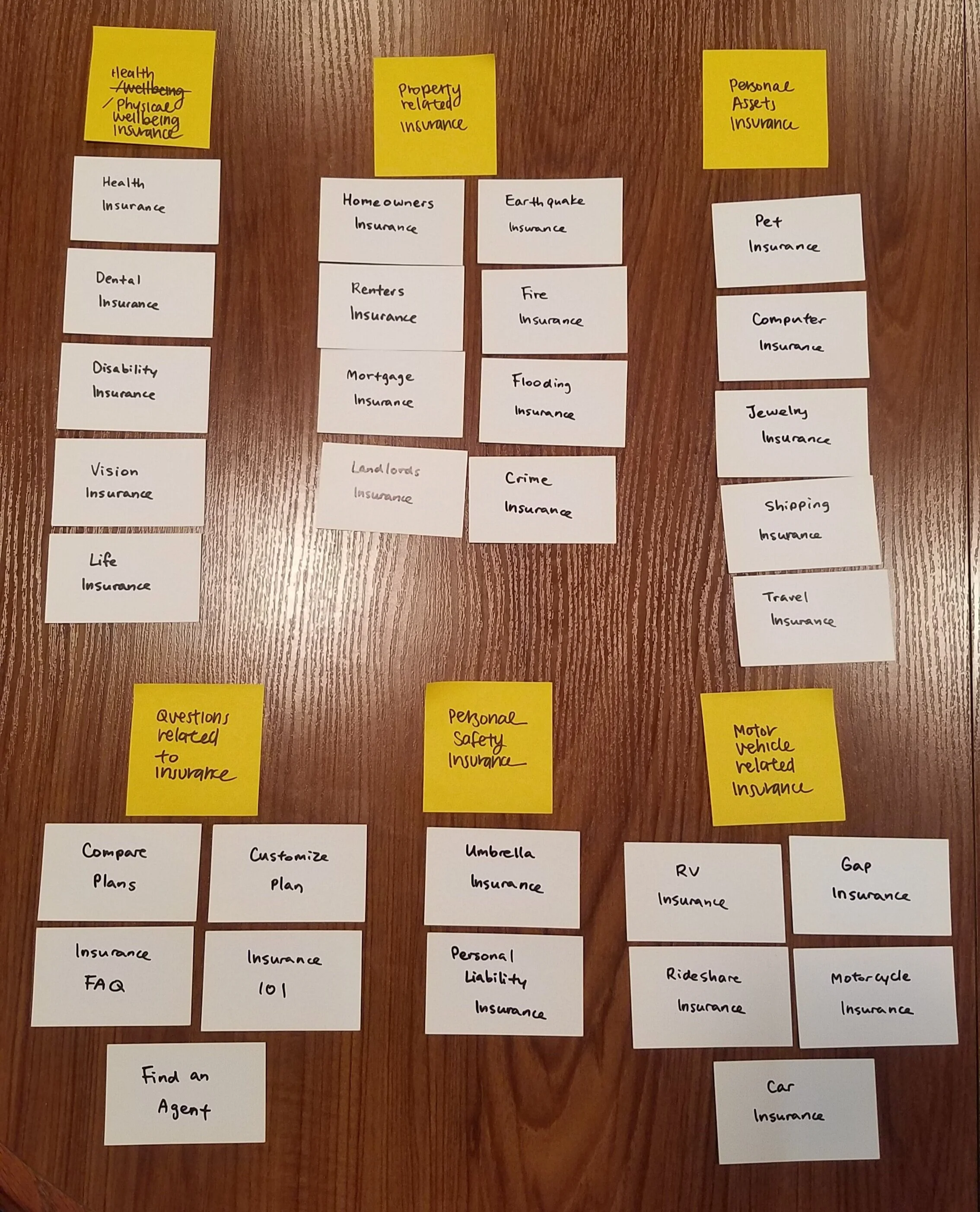
In order to organize the sitemap and navigation surrounding insurance searching, I conducted an in-person open card sorting activity. Participants grouped different types of insurance into their own perceived categories.
Surprising card sorting findings
There was user consensus only among insurance types for health, auto, or property-related insurance
There was confusion over whether life insurance was health-related or not
Participants would debate over whether a certain type of insurance was deemed essential or not
Labeling insurance was a challenge for many participants
Insights from the card sorting exercise were used to drive the implementation of Kaus’ sitemap.
Design & Test
Design ideation
Based on the organization and features defined during strategizing, I began to construct the user experience flow in sketches and wireframes. During design, I focused on fleshing out the following:
Navigation experience when searching for information on a particular insurance
Quote flow experience for both single and bundled insurance
Ability to return to a saved quote
Customized insurance packages selection
Mid-fi wireframe for homepage, introducing the company and offerings.
Form flow patterns used by existing e-commerce companies were analyzed when designing the quote request flow.
Rebranding is more than just the logo
Effort was spent on designing a suitable logo, but it was also important to design needed assets for this particular problem space, such as insurance-specific vector icons. In creating the high-fidelity prototype, numerous UI assets and design patterns were also referenced to create components that users would be familiar with.
The UI Kit brings together logo, style, and visual assets for Kaus’ website.
Testing usability for insurance flow
A prototype was tested to uncover critical issues in the design. The main goals of usability testing were to test the level of ease with navigation, identify any bottlenecks, and observe the paths that users took to complete each flow. The test was conducted with participants of varying levels of insurance experience to ensure that the website would be easily understood by all users.
Results from the test revealed three big insights:
The proximity of the insurance icons were very alluring to users, and enticed more user action than the navigation bar itself.
The icons’ visual dominance overpowered main call to action buttons, creating unnecessary steps when starting a quote flow.
Features meant to reduce users’ mental load, such as insurance plan filters, were not visually recognized.
Product revisions and next steps
Based on feedback collected from usability testing, the following priority revisions were made:
The homepage CTA was made more prominent to reduce confusion on how to start a quote.
Filter and bundle features were built out following common patterns to ensure users can easily find the plan they need to.
Copy was revised to maintain consistent and understandable language throughout the site.
Following UI revisions, the next steps in the project involve updating the prototype and conducting additional usability tests to verify these revisions. Given additional time, more features would be designed and tested, such as the complete checkout flow and the ability to file a claim on existing insurance plans. To close out the project, designs and documentation would be handed off to the development team.
Final Takeaways
Working on Kaus taught me a number of skills for designing and branding from the ground up, from conducting multiple methods of research, analyzing insights and relevant data, defining and strategizing on optimal user experiences and content architecture, to finally building consistent UI. I learned that pre-existing assumptions and hypotheses on user behavior are best validated early on in the design process to avoid reworking and inefficient decision-making.
The end result was a web experience that took into account users’ specific needs surrounding insurance, while also focusing on the digital aspect of purchasing an intangible insurance product.