Feather
Android app design for learning, exploring, and identifying birds
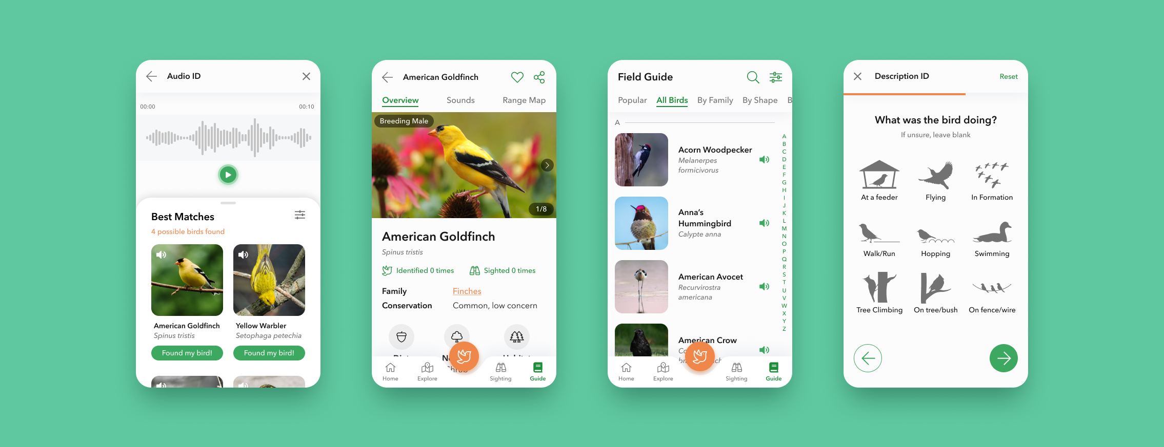
Feather aims to make birding and bird information easily accessible to those who wish to enjoy the great outdoors, by providing users with a database to discover bird locations, plan outings, identify species, and contribute to the local birding community.
Challenge
The idea for Feather surfaced while talking to a fellow birder about increasing diversity and access to information within the birding community. While various bird resources are available, many of them are not intuitive for new birders. Even on the field, users are having to switch between 2 - 3 related birding apps, detracting from the experience. With more people birding each year -
How might we allow beginner birders to easily learn about birds and their local environment on the go?
Objective
Design a mobile app that allows birders to explore local birding environments and access comprehensive species information.
Design a digital experience easily used on the go (based on research insight that complicated technology detracts from the in-the-moment birding experience.)
Researching the problem space
According to the U.S. Fish & Wildlife Service, more than 45 million people in the US watch birds annually. Birdwatching can vary from noticing a bird in one’s backyard to traveling to a hotspot for a specific bird sighting. Thus, I wanted to learn about current competitor resources and understand user pain points while birding in the field.
Research Goals
Understand who is birding and their motivations
Identify frustrations when planning trips or while birding
Identify exploration features that would be most valuable for beginner birders
Analyze current resources offered by competitor apps
Validate the need for an all-inclusive birding field guide and explore app
What are existing birding app resources?
Analyzing some of the most popular birding resources revealed that apps tended to have niche functionality, with Audubon Bird Guide being the most thorough resource. Each app typically focused on a specific key need, whether it was identification, community database, or bird tracking.
Interestingly, this divide was brought up by participants during my user interviews later on, showing a need for a more comprehensive digital solution.
Comparing features between top birding apps revealed niche functionality
Interviewing users on birding experiences
“How do you go birding?” To understand this question, I conducted several interviews via phone and video call to learn about:
Processes and resources that experienced birders use to help them plan and learn about birds.
Concerns or barriers that are preventing amateur birders from becoming more involved.
An unprecedented challenge during this phase was finding active birders to interview, particularly during the COVID-19 pandemic when outdoor activity is much more restricted. Eventually, I found participants by contacting a birder who was part of a bird community group.
The user interviews revealed 6 key insights:
Birding is a meditative experience.
Birding helps users appreciate and be aware of the world. Those who engage in it do so to be in the moment of nature.
Birds have varying situations.
Resources need to cover all types of situations. Birds look different at each stage, and have multiple calls. A field guide cannot only have one example.
Identification is a thrilling challenge.
Users find it exciting but difficult to identify birds, particularly by song. If users cannot look up birds immediately, it becomes hard to remember key characteristics later.
Comprehensive filtering saves headaches.
Whether filtering for a bird by key characteristics and season, or filtering for hotspots based on distance and time, users expect to find the right information with little effort.
Better planning = better birding.
For active birders, better planning for when and where to go is crucial pre-work. Knowing what birds are in season and where will help them bird more successfully.
Complicated technology is distracting.
Using technology detracts from the “in the moment experience”, leading to other frustrations after birding. Any digital tool used on the field needs to be simple and fast.
“Birding gets me out of my world and into nature. It’s honestly kind of meditative for me, it makes me want to be in the moment...not thinking about work or life problems. I’m just looking around and seeing what’s in front of me.”
Building user empathy
The competitive analysis and user interviews gave me a better understanding of who the users were and how they might use a birding app. I focused on expanding those findings into concrete visualizations that would help me empathize with users and define the product.
Persona Development
Based on patterns from my user insights I developed two personas - a casual / beginner birder and an experienced / photographer birder. Since the goal of the project was to make birding more accessible to everyone, it was important for the features to be intuitive for beginners. As such, the Bird Beauty Appreciator was the primary persona I focused on for the rest of the project’s development.
The casual / beginner birder persona was used as the primary persona
The secondary persona could be used in the future for further development
Most of the journey happens outside of birding
Talking to users helped me realize the birding journey started and ended much before and after the user observes a bird. The user’s actions and decision-making begin from planning an outing in advance to exploring more resources days later.
I created a user journey map to graph out the thoughts, feelings, and sights that my interviewees had shared with me to identify main touch points the app would need to cover.
Mapping out the user journey map showed important touch points before and after observing a bird
Translating needs into features
From the touch points and needs gleamed from the empathizing phase, I created a Product Feature Roadmap to outline specific app features and organize upcoming design efforts.
Prioritization was determined based on the alignment of a feature’s value proposition with the project’s goals and user’s needs. Due to project limitations, I had to focus on features that would be required in an MVP product according to the primary persona.
Design & Prototype
With a better understanding of the users and priority app features, I began designing how those features would be realized. Feather would focus on three main capabilities -
Exploring birding hotspots
Identifying unknown birds
Learning about birds through a field guide
Sketching users flows & understanding recognition technology
To establish user flow and content layout, I sketched out wireframes for screens that users would need in order to complete the three main tasks. One of the biggest considerations was designing how the identification flow would work, as I wanted to bring together multiple methods of species identification.
This part of the process required doing a bit of research into photo and audio technology to understand the basic limitations of what the app would be able to achieve. For example, I later built in a selection and zoom step in the photo ID flow, based on methods to increase accuracy in AI photo recognition software.
Sketches showing the flows for three different methods of bird identification - photo, audio, and text
Based on the user insight that technology detracts from the meditative birding experience, the identification feature must be easily accessed with one hand and without much effort.
I decided that a central button on the bottom navigation would serve as a point of access for all identification needs. The proximity to the user’s thumb would allow them to easily access the identification feature even if users were outdoors.
Being playful with UI design
While designing the product’s logo, branding, and user interactions, I focused on creating a visually friendly and inviting feeling to welcome birders of all backgrounds.
Feather was picked as the app name for its lighthearted and abstract connotation to birding. I then designed multiple logo variations based on the abstract motif of a bird, with the final iteration selected after receiving feedback from birding community members.
Onboarding Illustrations
Considering Seasonality
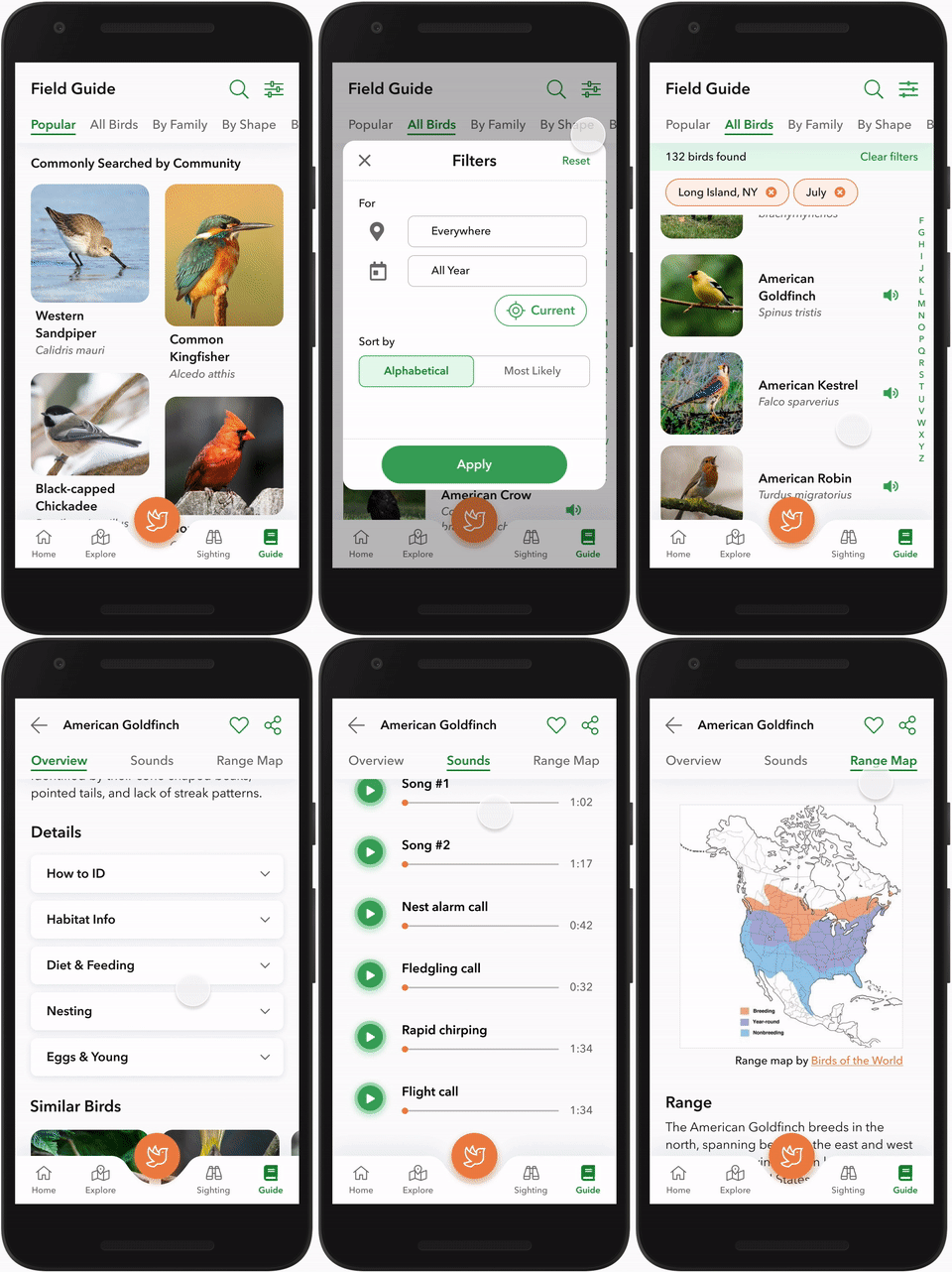
The field guide was designed to make it easy and fun to search for birds. Narrow down results with just a few taps by filtering for birds in their current area and season.
Content strategy for these screens involved determining which information was most useful (based on user responses) and organizing the content hierarchy.
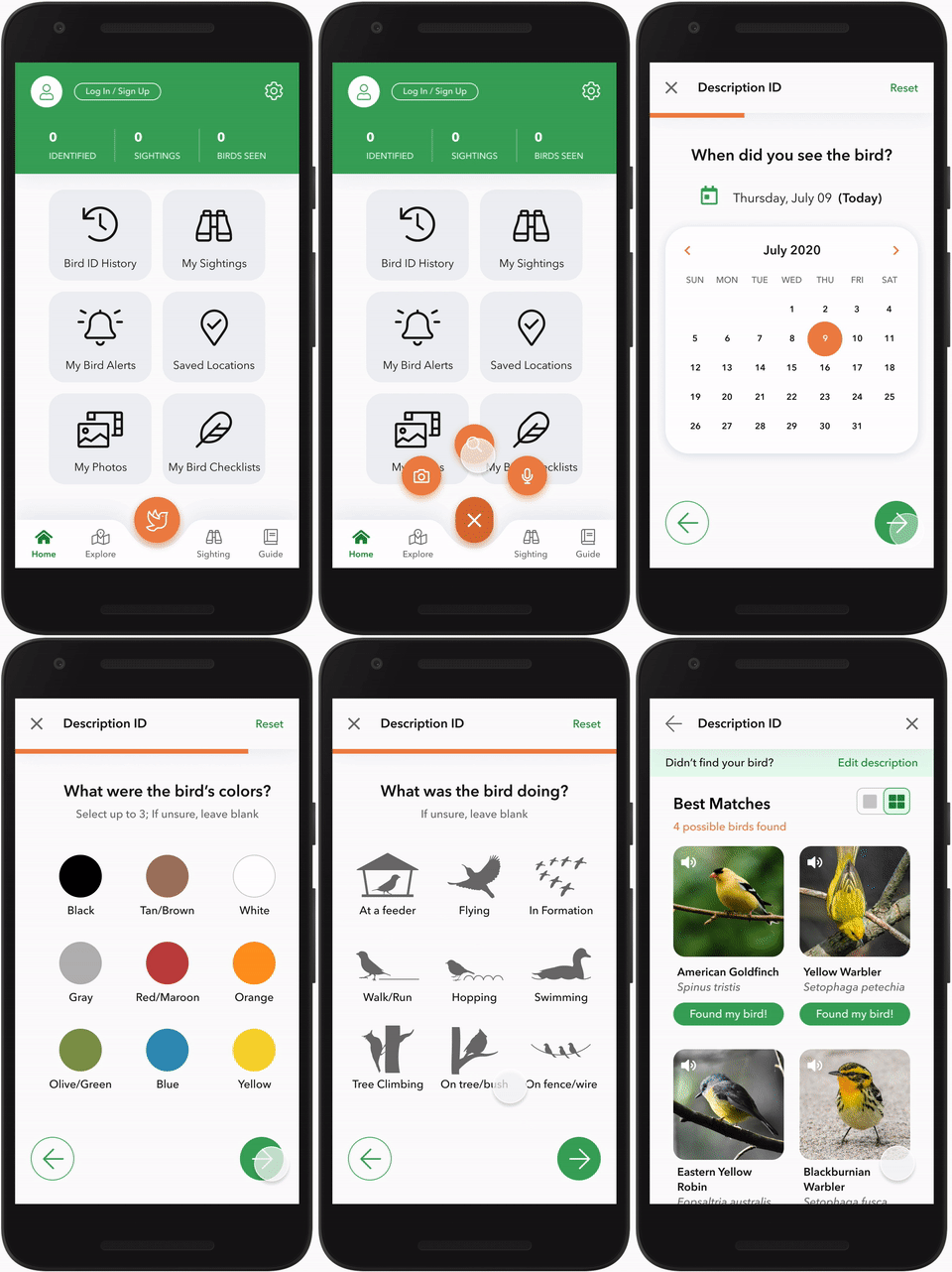
Simplified ID flow
The audio and photo ID features are immediate and help reduce cognitive load on the user, but using them may not always be possible.
With a simplified description ID flow, users can -
Easily insert in key characteristics to be matched with most likely species.
Complete the search quickly even with only one hand.
Delightful Interactions
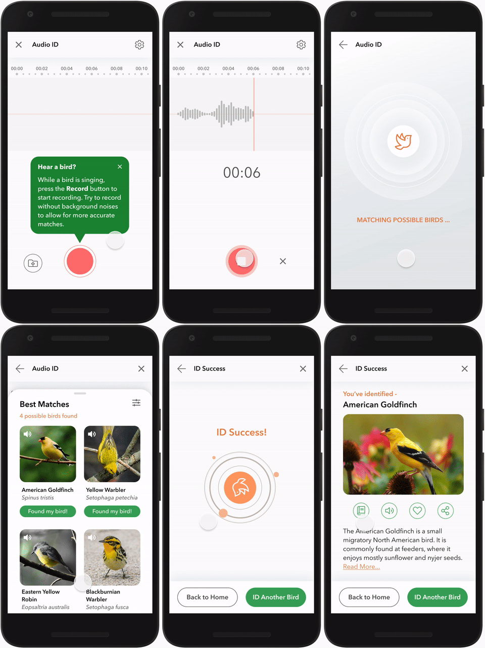
I learned from users that successfully identifying a bird makes them feel good and accomplished. This was an emotion I wanted to recreate in the app.
Adding an ID success animation brings forth that satisfaction upon selecting the final button in the identification flows.
Test & Iterate
The app design included navigational and technical features such as searching on a map and using photo/audio recognition to identify birds. I conducted a round of usability testing on a high-fidelity prototype to identify core issues in these features.
Challenges of remote mobile testing
In order to observe user micro-interactions, it was important for the test to be moderated. However, given the COVID-19 pandemic, the most practical method was remote testing.
With limited time and resources, finding the best way to conduct remote mobile testing was a challenge. I settled with the “laptop hugging” method, where users pointed their laptop webcam down towards their phone.
Using this method I could observe hand gestures, scrolling, and other tapping movements. The tradeoff is the inability to see participants’ facial expressions, which I tried to make up for by probing with follow-up questions.
Revisions and final wireframes
Testing revealed that the main issues were confusion over how to access the ID features, lack of indicators such as showing when a selection was applied, and need for more useful filtering options. Based on the feedback, I applied the following revisions to my wireframes:
Revised onboarding flow to strengthen ID button recognition
Updated prototype with indicators using weight and color
Added expected interaction patterns carried over from other apps
APP LOADING & EXPLORE FEATURE
BIRD FIELD GUIDE
SPECIES IDENTIFICATION
Project Reflection
What’s Next?
Following the first round of testing, the next steps would be to iterate and design for features beyond the MVP.
Build out phase 2 & 3 features - Bird Sightings and Community Sharing
Conduct second round of user testing in the field, to identify active usability issues
Prepare deliverables for development handoff
Project Takeaways
I knew going into this project that it would be a challenge. What features are most important? How would they work with recognition technology limitations? Given the diversity problems that the birding community faces, what are some ways an app solution can provide relief? I found myself truly enjoying the process of designing and strategizing flows and user interactions.
Some key takeaways are:
Create a well-organized project plan. With so many issues to consider, a good strategy will prioritize on what’s needed for the MVP and keep track of backlogs.
Understand tradeoffs in decision-making. Knowing when and why to use a particular tool or research strategy is part of the critical-thinking needed to successfully deliver.
Use existing patterns to decrease cognitive load. Spending time designing a unique interaction for a common function isn’t necessary if users already expect it to work a certain way.
While an app cannot solve all the needs of the birding community, I believe that a good user experience can facilitate more community action and discussion. In a divided world with a sore need for environmental efforts from the public, increasing access to learning and awareness often begins the step to bridging gaps between our community.


