Bento-Ya
Responsive Web Design for a Delivery-Only Restaurant Concept
Bento-Ya is a food business in Washington, DC in its early stages of business planning. They intend to operate as a delivery-only business, taking advantage of the virtual restaurant and ghost kitchen trends growing in the DC metropolitan area. I worked closely with the client to plan, design, and establish their branding and online ordering website.
Role: UX + Brand Designer
Client: Thomas (Bento-Ya Founder)
Tools: Figma, Adobe Illustrator, Air Table, Whimsical
Project Duration: Spring 2020
MY ROLE
Bento-Ya needed a website to help spread the word and allow users to place orders online. My task was to design the branding and a responsive website that incorporated key virtual business features of food ordering/delivery and a rewards system.
The project was divided into 4 iterative phases, with each phase involving meetings with the client to present deliverables, handoff revisions, and discuss next steps.
Discovery
A virtual restaurant is an establishment with no physical brick-and-mortar location. Food is prepared for takeout or delivery only, often in a food preparation facility known as a ghost kitchen. By this definition, Bento-Ya aims to compete in the virtual restaurant space, offering an interesting challenge to get users to visit their website to order delivery.
UNDERSTANDING THE MARKET
Learning is a non-linear process. Throughout the project, I conducted market and competitive research to understand the needs and gaps of this growing space. I also initiated multiple stakeholder interviews to ensure I could meet my client’s business requirements.
My research process involved the following:
Define objectives & plan
Outline hypotheses & assumptions
Select methods to fill gaps in knowledge
Conduct research and gather data
Synthesize findings
TALKING TO PROSPECTIVE CUSTOMERS
To gather more qualitative data about our potential user's motivations, pain points, and needs, I interviewed 6 DC locals who lived and worked in downtown DC. These participants all had experience ordering food online, and fall under my client’s target customer demographic of a young DC professional. I wanted to answer the question:
What would a customer need from a site for an online-only establishment?
“I enjoy and prefer ordering online. It streamlines wait time for me, and I like the security of being able to order ahead of time and have food be ready.”
“Sometimes if I’m in a conference call and I don’t have time to pick up food after, I’ll mute the call and quickly place an online order”
INSIGHTS AND ISSUES
Word-of-Mouth is a powerful discovery method - there is strong trust in “foodie” friends or coworkers, if a friend suggested it then the user is more likely to try the food place.
Delivery is nice but expensive, so users need a reason to justify their order.
Appeal of photos and reviews drive ordering decisions.
Nutrition information is important because many users are health-conscious and/or have dietary restrictions.
Users expect online platforms to be seamless - the growth of online ordering apps and the COVID-19 pandemic have caused a boom in food delivery, but many platforms are falling short of user expectations for efficiency.
All research was presented to my client in a slide deck
Exploration
While exploring product strategy, I created an empathy map to extract patterns of user needs and frustrations, and laid out the site’s information architecture. Using the research insights as feature value propositions, I also created a list of features to determine must-haves for an MVP website. Prioritization was determined with an impact vs effort analysis. This phase lay the ground work to later wireframe solutions and content strategy.
INFORMATION ARCHITECTURE
Given that this was a restaurant website that offered delivery, I proposed a sitemap that incorporated core content for ordering, tracking, and redeeming rewards.
USER FLOW INTERACTION
Following the site architecture, I laid out task flows of a user visiting the site, adding items to cart, and going through Bento-Ya's checkout process. The flows identify and consider how various tasks are connected throughout the ordering process.
Task flow identifies necessary interactions in core user actions.
User flow showing decision points throughout the user’s path.
A challenge I faced was figuring out the flow for the rewards system, and how users would redeem and check rewards as returning customers.
Based on existing design patterns, users expect rewards information to be easily accessible in their account, but from a business standpoint it was important to move that flow higher up in the ordering process to incentivize users to sign up or redeem.
SKETCHES & WIREFRAMES
Brainstorm sketches on early concepts of content layout and dialog components.
Design & Iterate
Wireframe designs were iterated upon through usability testing and client feedback, with each iteration improving on design choices and visual hierarchy.
Testing was conducted remotely with local DC participants over Zoom. I was able to observe participants’ interactions and had them “think aloud” as they navigated through a prototype.
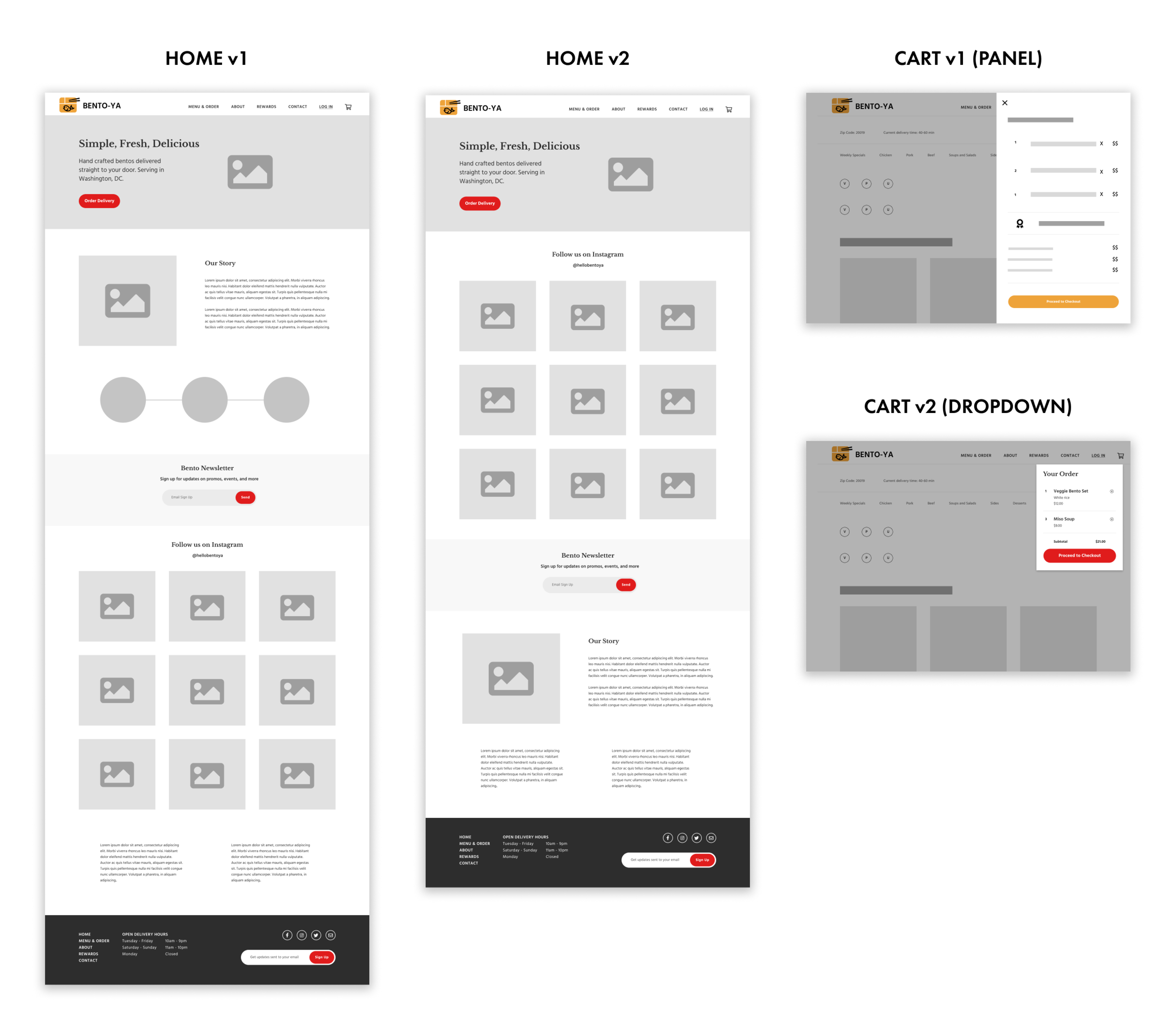
Content hierarchy shifted over the course of various iterations.
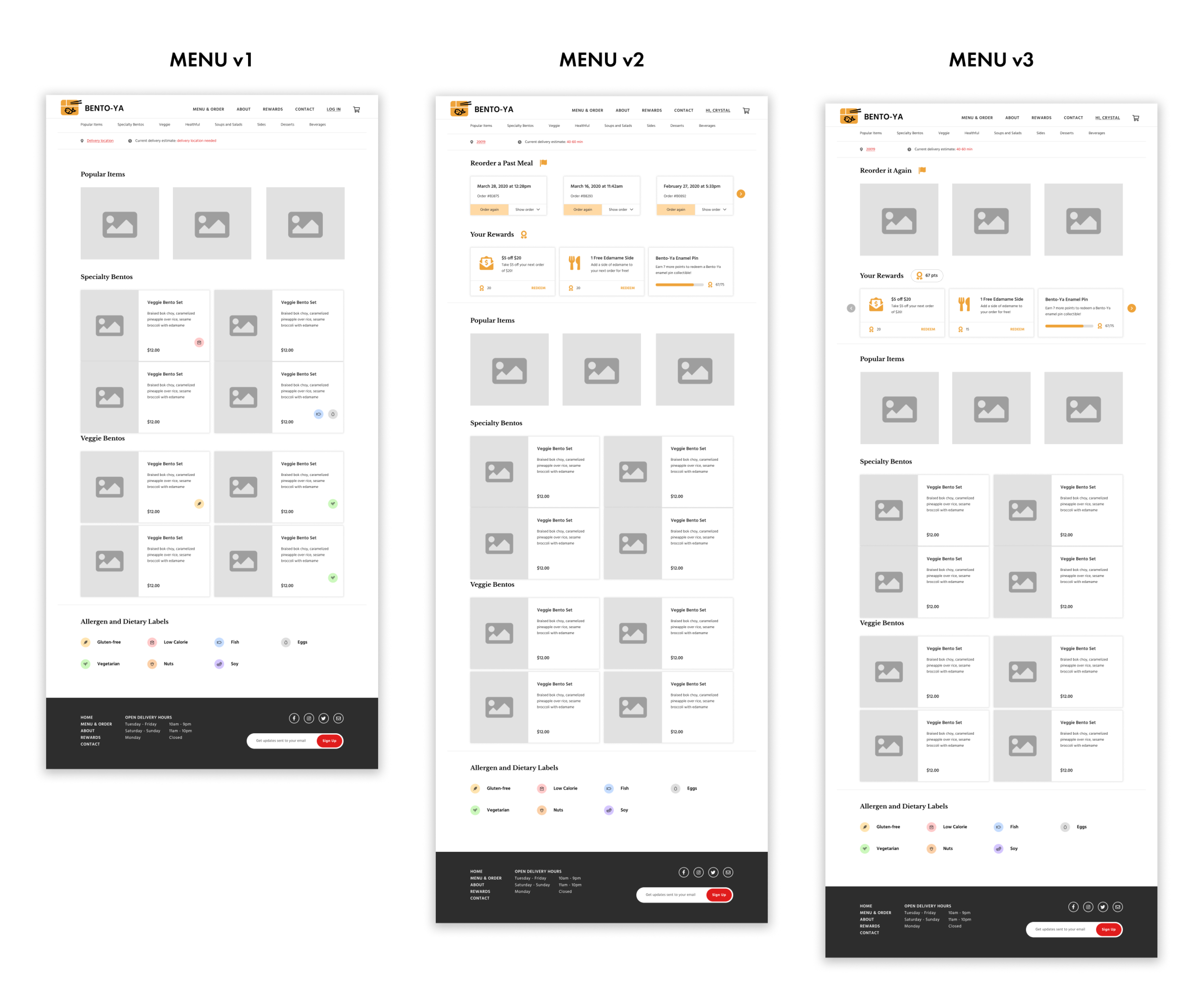
Menu page iterations showed that designs for physical menus may not always work digitally.
ITERATION LEARNINGS
With each iteration, I synthesized feedback by plotting and categorizing issues on an affinity map. This helped me make design improvements based on user patterns and key pain points.
Some key insights:
Pertinent business info was taking too much effort to find in early iterations
Necessary dialogs were still frustrating to see; I changed their timing and placement to be more streamlined in the experience
Common elements in physical menus (e.g. nutrition info) need different hierarchy online
Design elements needed to convey clear action but offer user flexibility
Affinity mapping helped identify patterns in pain points.
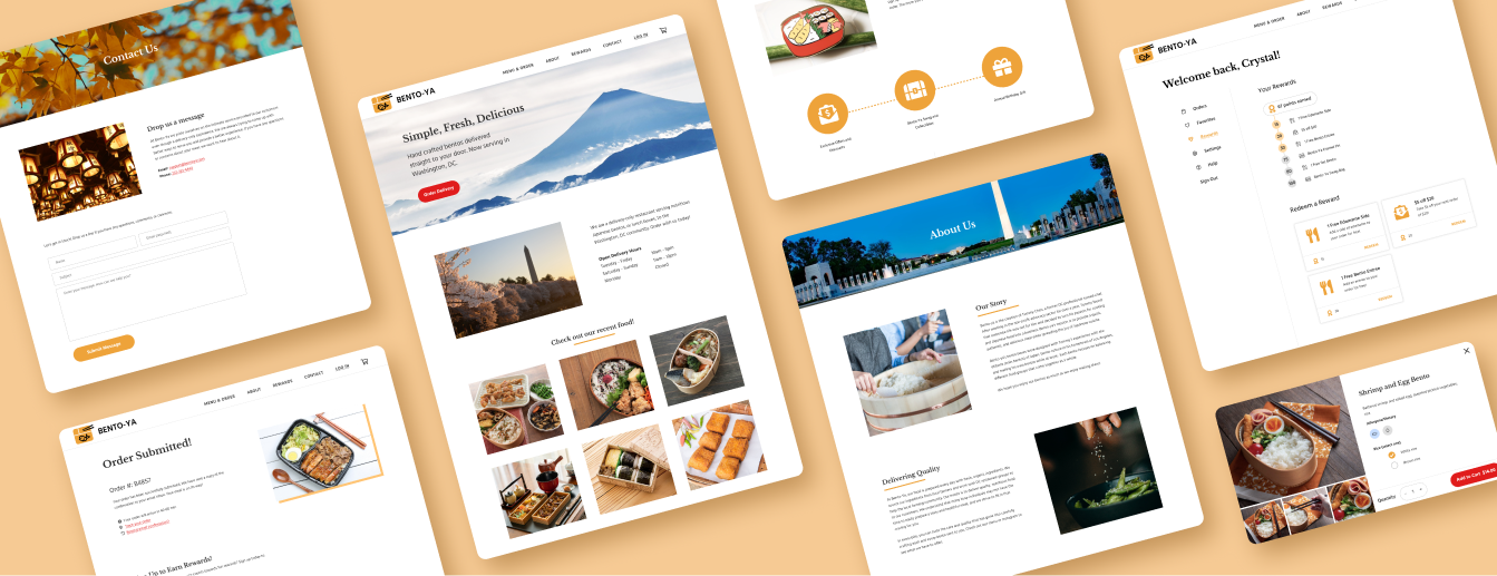
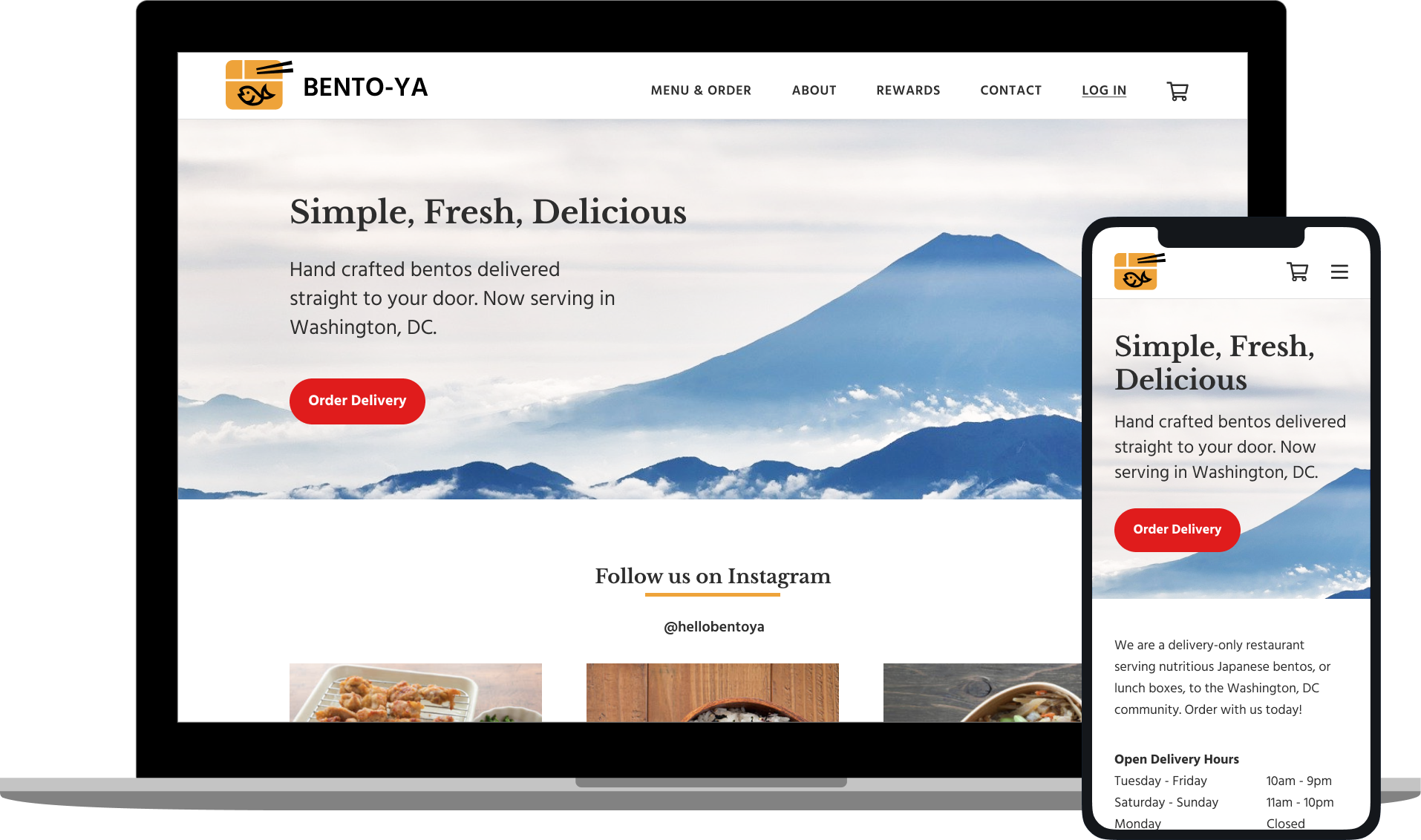
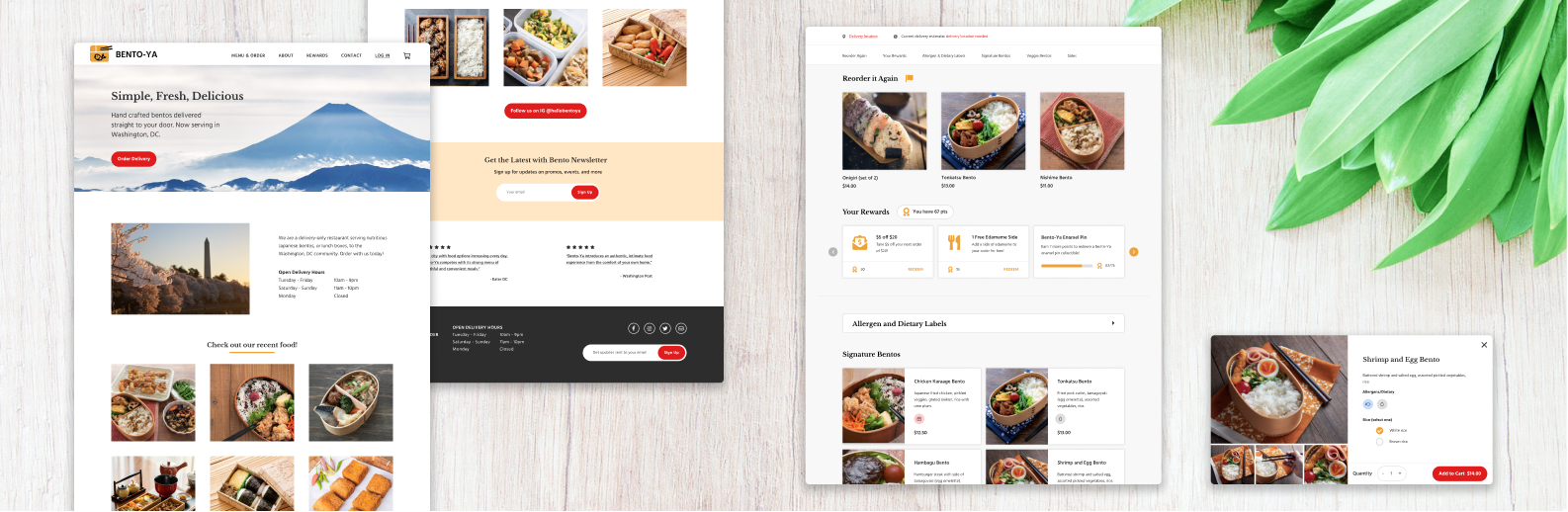
HIGH-FIDELITY DESIGNS
“Our Story” was moved to its own “About” page to clarify content placement and put more focus on food photography, given that appealing photos was identified as a key user decision factor in ordering.
The zip code dialog caused a lot of frustration during usability tests. I changed it to show up only after the user tries to add an item to the cart, which allows customers to browse the menu freely without hinderance.
Allergen labels were moved to the top of the menu page for more visibility, and inserted under an accordion to save on space taken up.
Branding
Brand design was done concurrently with wireframe iteration. I gathered logo and brand requirements from the client, and sketched out a number of concepts. We went through two feedback and iteration sessions before deciding on a final logo design.
LOGO ITERATIONS
Various logo concepts based on client requirements.
IMAGERY
Moodboard imagery was developed with the client to align on brand direction.
In the first round of iterations, my client suggested creating a multi-color detailed illustration for the logo. I defended against using a complicated logo, and brought up use cases such as viewing the site on mobile, printing costs, and printing takeout packaging where a detailed logo would dilute the visibility of his brand.
STYLE TILE
The final style tile brings together UI elements that dictated the high-fidelity designs.
Reflection
LOOKING FORWARD
At the moment Bento-Ya’s design work is paused to allow business planning to catch up. Per the client’s timeline, our next steps are as follows:
Refine logo design to seamlessly work across all possible digital and printed business materials, such as printed packaging and takeout containers.
Iterate and test further wireframe designs based on likely business changes.
Work with Bento-Ya’s contract developer to create live website and prepare for business opening.
PERSONAL LEARNINGS
1) Adapting to changing requirements
Bento-Ya is a project where the design work came in a little early before established business planning. I learned a lot about creating visual branding when there were changing requirements and no concrete assets to work off of. It was rewarding to see our website solution be crafted from scratch.
2) Clear client communication
One aspect that surprised me was how significant the time zone difference between myself and my client could affect the process. I was challenged to work efficiently and maintain good communication with the client every step of the process, as well as ensure any DC test participants were scheduled properly.
3) Align goals throughout the process
When confusion happened between myself and my client, I noticed it was usually due to misaligned expectations. Realigning goals and going over business needs, development considerations, and customer insights helped bring us back to the same page. My client found it helpful to learn more about users’ needs, as there were human-centered aspects that he had not thought of during business planning.